
Chris Gray
2 min read
Think the Home Button is Unnecessary? Think Again
There is a persistent trend of removing the home button from website navigation which can create potential usability issues. It is important that users can easily access the homepage. There are alternate approaches to the conventional home link placement, however it is important to user test possible solutions.
There has been a trend over the years, which is not particularly new, to remove the home button from website navigation. I’m not sure why this is, maybe it is to free up some space for other navigation options or maybe it is because there is an assumption that users understand the convention of making the company logo a link to the homepage. Regardless of why it is done, countless usability test sessions I have observed and run strongly indicate that this simply doesn’t work.
I recognise that a large number of users understand the logo convention however time and time again participants turn up who are not familiar with it. Usually, their only way of getting back to the homepage is to use the back button – which can be a real pain if they have been on the site for a while or the back button acts as an undo for in-page functionality (think search filters). While it may seem trivial, getting back to the homepage is a fundamental aspect of user behavior when navigating websites. This remains true today even when we know that less traffic arrives on the homepage (http://giraffeforum.com/wordpress/2010/04/18/the-decline-of-the-homepage/). The homepage is commonly used by people to orient themselves on a site. Something along the lines of, the information I was seeking wasn’t there, so I’ll go back to the homepage to look elsewhere for it. Ironically it can be the users who are less experienced or confident online who get lost and need to get to the homepage to re-orient themselves.
LinkedIn uses a very conventional home button which will almost certainly be understood by users:

Home link
If there is a genuine need to deviate from a conventional home link, below are two examples of sites that take a slightly different approach but are likely to be effective.
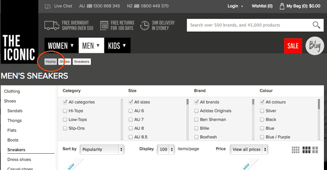
Example of Alternate home link]
Both sites place the link in the top left of the screen, a conventional location. Asos saves space by using an icon while The Iconic avoids having to include a home link on their homepage by using prominent breadcrumbs.
The humble home button plays an important role in assisting people to navigate and use a website effectively. If there is a need to avoid a conventional home link consider a creative approach, but keep in mind that usability testing with real users remains important when deviating from known and established conventions.
Chris Gray
Managing Director & Principal Consultant
Chris is a leader in the human-centred design field with a 20+ year track record of improving customer interactions for some of Australia’s largest organisations. His broad experience includes lecturing in human-centred design at Melbourne and Monash Universities, teaching at General Assembly, and holding board positions for and advising numerous technology start-ups. An accomplished workshop facilitator, Chris excels at engaging with senior stakeholders and guiding projects to success.
Latest posts


Chris Gray
16 Sept 2026
Why making still matters in the age of AI
Nomat’s founder revisits why physical, hands-on methods like LEGO® Serious Play® still matter in an AI-driven world, arguing that the “mess” of making something is often where real thinking happens, and that teams risk losing it when AI hands them a polis...

Bao Nguyen
17 Mar 2026
There's a person behind every great AI conversation
Conversation Designers are the secret behind great AI. Learn what they do, why they matter, and how Nomat can help.